
 Question
Lab 2: Designing for Tablet and Desktop Viewports for Steve’s Screen Services
Problem: You work for a screening company called Steve’s Screen Services that specializes
in screening, cleaning, and repairing screened patios. The company has asked you to create a
responsive website. You have already created the website, but now need to create the Services and
Gallery page. You add and style semantic elements for both pages. Style the webpages as shown in
Figure 7–96 and Figure 7–97 for mobile, tablet, and desktop viewports.
Instructions: Perform the following tasks:
1. Copy the image files in the lab2\images folder from the Data Files for Students to your lab2\
images folder and replace the old screen1.jpg file with the new screen1.jpg file.
2. Open your text editor and then open the stevescreen.html template file in the template folder
and use it to create the services.html file.
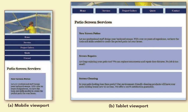
3. In the services.html document, add a section element within the main element. Create
an h2 element within the section, <h2>Patio Screen Services</h2>.
4. Add an article element within the section element and then add the following
elements within the article element:
<article>
<h4>New Screen Patios</h4>
<p>Let our professional staff design your backyard escape. With over
20 years of experience, we have the tools and skills needed to create
the perfect patio for your home.</p>
</article>
5. Add a second article element after the first article element, but within the
section element, and then add the following elements within the second article
element.
<article>
<h4>Screen Repairs</h4>
<p>Are bugs enjoying your patio too? We can replace torn screens and repair door fixtures. No job is too small!</p>
</article>
6. Add a third article element after the second article element, but within the
section element, and then add the following elements within the third article element:
<article>
<h4>Screen Cleaning</h4>
<p>Is your patio looking less than pretty? Our environment-friendly
cleaning products will have your patio looking brand new in no time.
We offer a 100% satisfaction guarantee.</p>
</article>
7. Open your text editor and then open the stevescreen.html template file in the template folder
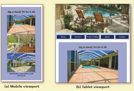
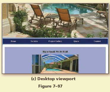
and use it to create the gallery.html file.
8. In the gallery.html document, replace the image file name on Line 22, screen1.jpg, with
galleryBanner.jpg.
9. In the gallery.html document, add an article element within the main element. Create an h3
element within the section, <h3>Big or Small, We Do It All</h3>.
10. In the gallery.html document, add the following figure element within the article element,
below the h3 element:
<figure>
<img src="images/screen2.jpg" alt="Gallery picture 1">
<img src="images/screen3.jpg" alt="Gallery picture 2">
<img src="images/screen4.jpg" alt="Gallery picture 3">
<figcaption>Small patios, large patios, pool enclosures</figcaption>
</figure>
11. In the screenstyles.css file, modify the comment at the top of the page to include today’s date.
12. In the screenstyles.css file, add the following style rules to apply to the mobile viewport and
include comments for each:
article h3 {
text-align: center;
}
figure {
text-align: center;
}
figcaption {
color: #000066;
}
section {
padding: 1em;
}
article {
margin: 1em;
padding: 1em;
background-color: #ACB7E6;
}
13. In the screenstyles.css file, remove the img style rule from the tablet and desktop media queries.
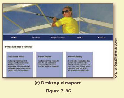
14. Add the following style rules to the desktop media query and include a comment for the style
rule:
section article {
width: 22%;
float: left;
height: 15em;
}
15. Save your changes for all files and open the Services page in your browser, and the page in a
mobile, tablet, and desktop viewports, as shown in Figure 7–96.
16. Open the Gallery page in your browser in mobile, tablet, and desktop viewports, as shown in
Figure 7–97.
17. Validate your HTML code and fix any errors.
18. Validate your CSS code and fix any errors.
19. Submit your assignment in the format specified by your instructor.
20. In step 12, you created a style rule for a figcaption element. Discuss at least three different
properties you would use to improve the appearance of this element.


Sorry the answer is not available at the moment…
If you are able to find the answer, please make sure to post it here. So that your Juniors have smile on their lips and feel happy.
Spread the 'tradition of sharing'.